Student services · Landing page and 4 persona pages
Casmir Educational Services
Admission, JAMB and student paperwork, with a clear path for every kind of visitor.
The brief
Casmir Educational Services helps students with the paperwork around getting into and staying in university: JAMB registration and CAPS access, post-UTME, school fees, admission letters, birth and state-of-origin certificates, NIN and BVN services, and more. Casmir has run it for two years and serves students anywhere online.
The page had two jobs. Put a long list of services in one place without overwhelming anyone, and calm the three worries his customers have before they send a stranger their documents: being scammed, getting fake documents, and paying too much.
What I did
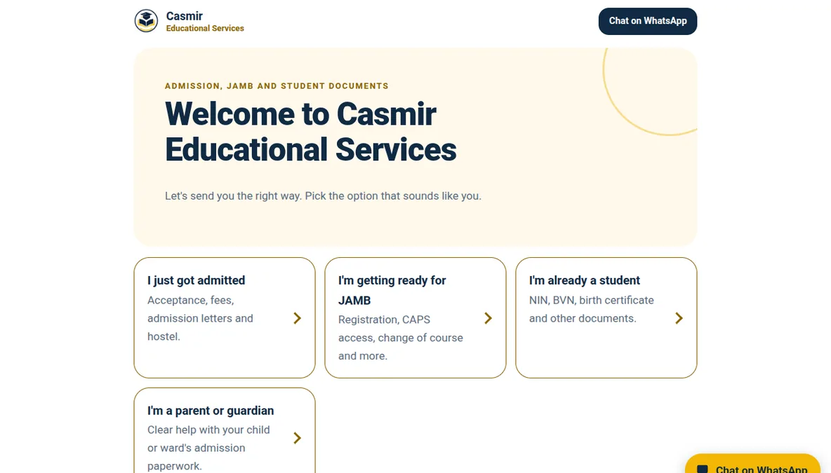
Instead of one long page for everyone, I started from the visitor's situation. The homepage asks one thing, “Pick the option that sounds like you”, and sends four kinds of visitor to four pages: someone who has just been admitted, someone getting ready for JAMB, a current student, and a parent or guardian. Each page speaks to that person's worries and ends in WhatsApp.
Casmir offers well over a dozen services, and a list that long hides the ones people came for. We settled on six main services, shown as cards that open WhatsApp with the message already typed, so a nervous student never faces a blank chat box.
There are no prices on the page, and that was Casmir's call. Official fees change during the year, and he didn't want every conversation to start with “others are cheaper”. Where an official fee is involved, the page tells students they'll see it and his own fee as two separate amounts.
Trust is shown rather than claimed. “How it works” is Casmir's own three steps (check the requirements, process and verify, then deliver with next steps) in plain words, and it says you see the details before anything is submitted. Below it, real conversations with students sit under captions that say what happened, with phone numbers hidden.
The look comes from his logo: navy and gold on warm paper, rounded cards, and a floating WhatsApp button that follows you down the page. Friendly and student-like, but not childish. The copy comes from Casmir's own answers to a short poll on WhatsApp.
Results so far
Mobile
Mobile performance is 83, below my usual standard. I haven't diagnosed why yet.
Desktop
Conversion results: not enough data yet. Almost every enquiry happens inside WhatsApp, where I can't see it, so there's no honest conversion number to show. I'll update this case study once there's a reliable way to count it.
Want a page built with this same care?
Send me the link to your page. I'll tell you the 3 things I'd fix first, free.
Get my free audit